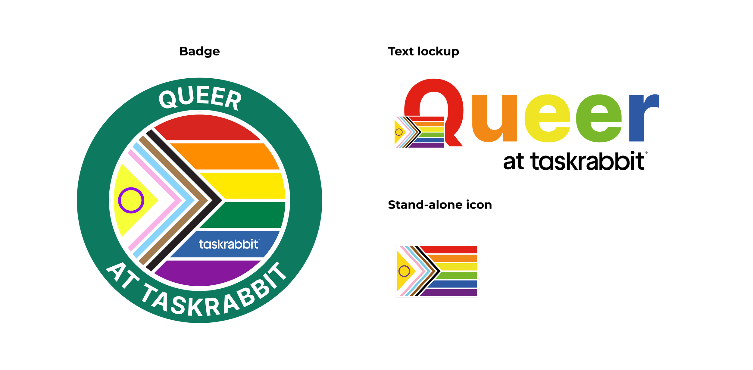
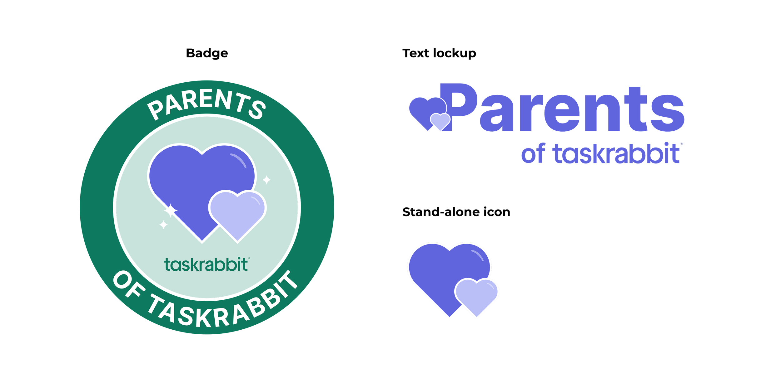
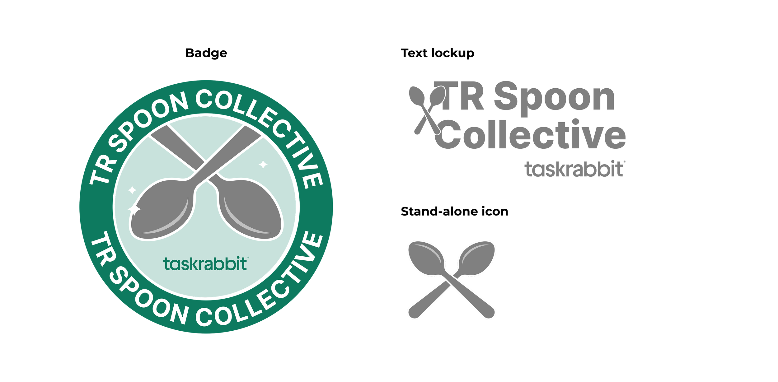
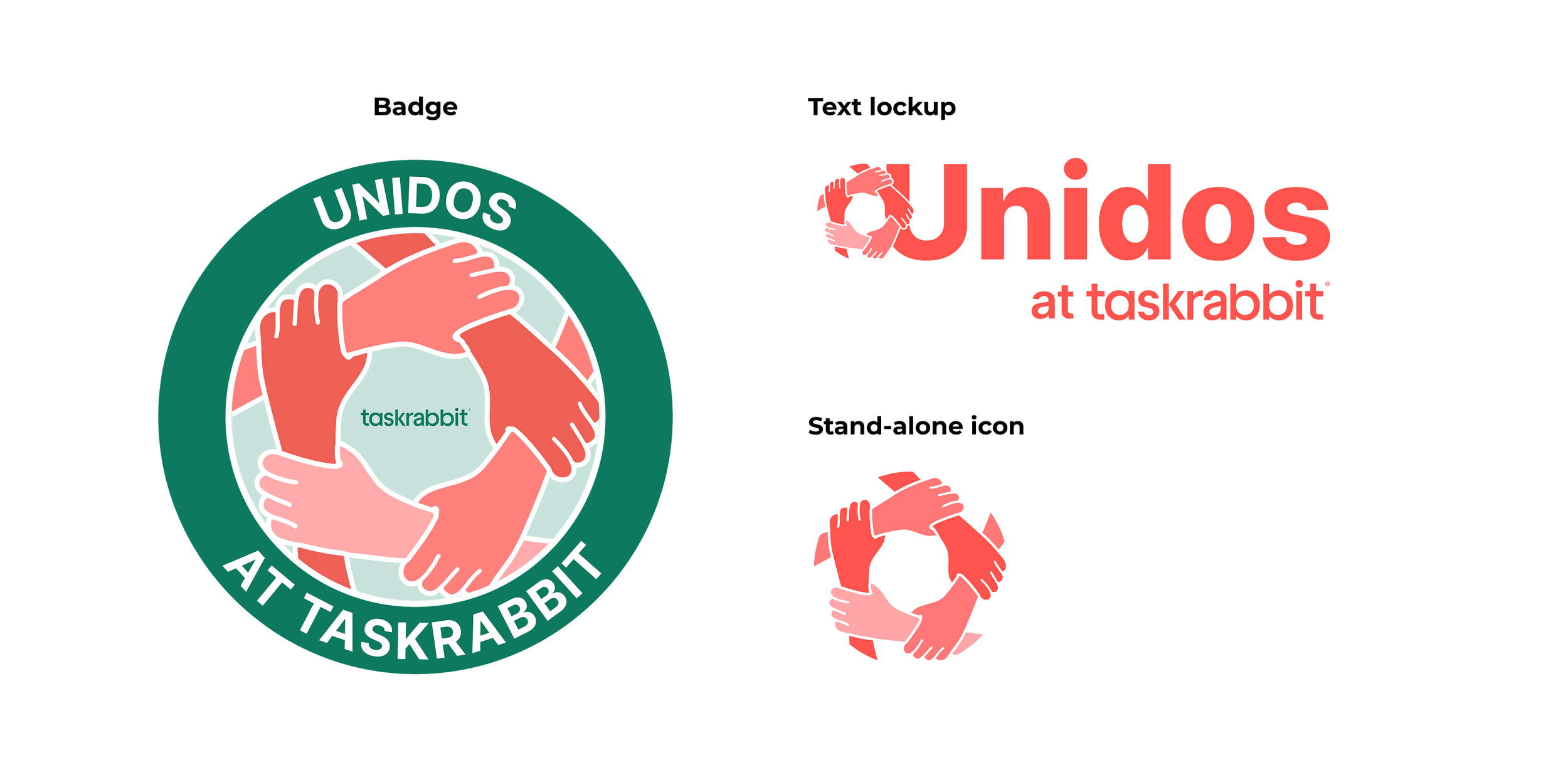
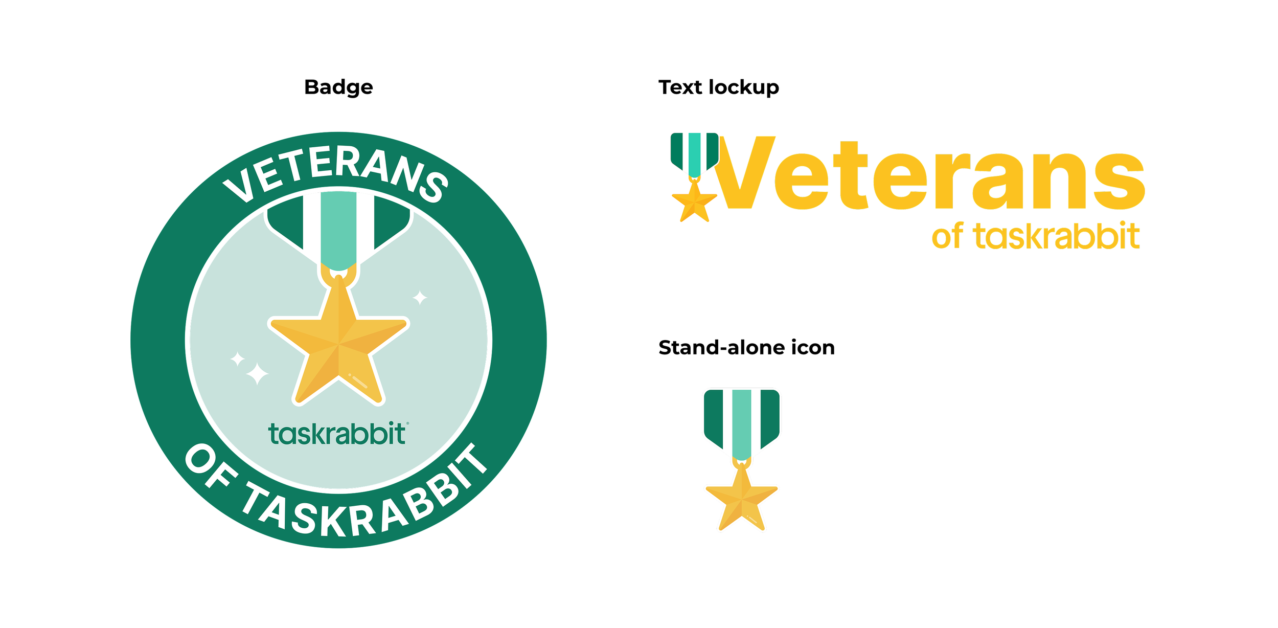
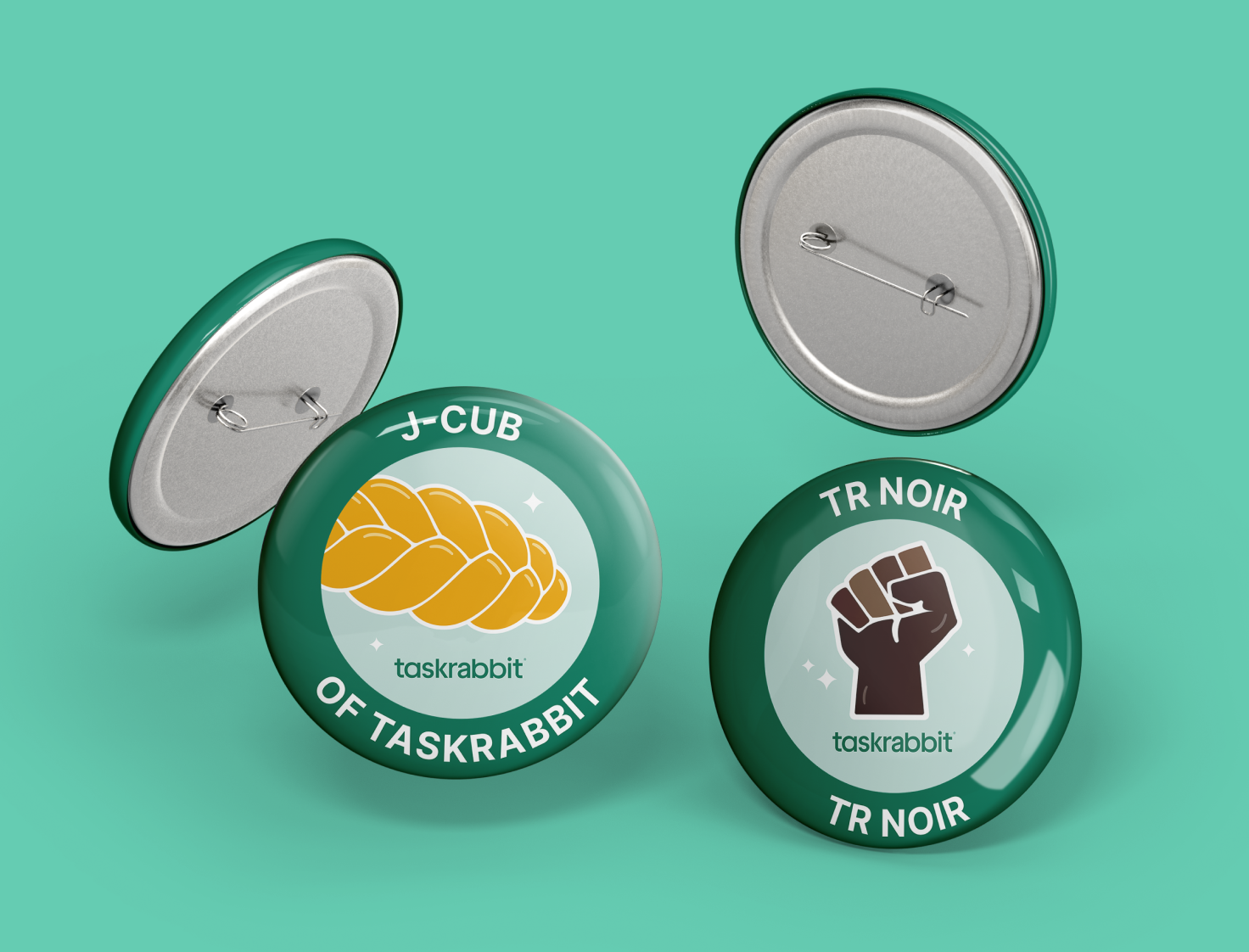
Taskrabbit Employee Resource Group Logos
Taskrabbit had a growing network of Employee Resource Groups (ERGs), but each group’s logo existed in isolation, stylistically inconsistent, and lacking a unified brand structure. I developed a cohesive identity system that brought all 13 groups under one visual umbrella while preserving what made each group distinct.
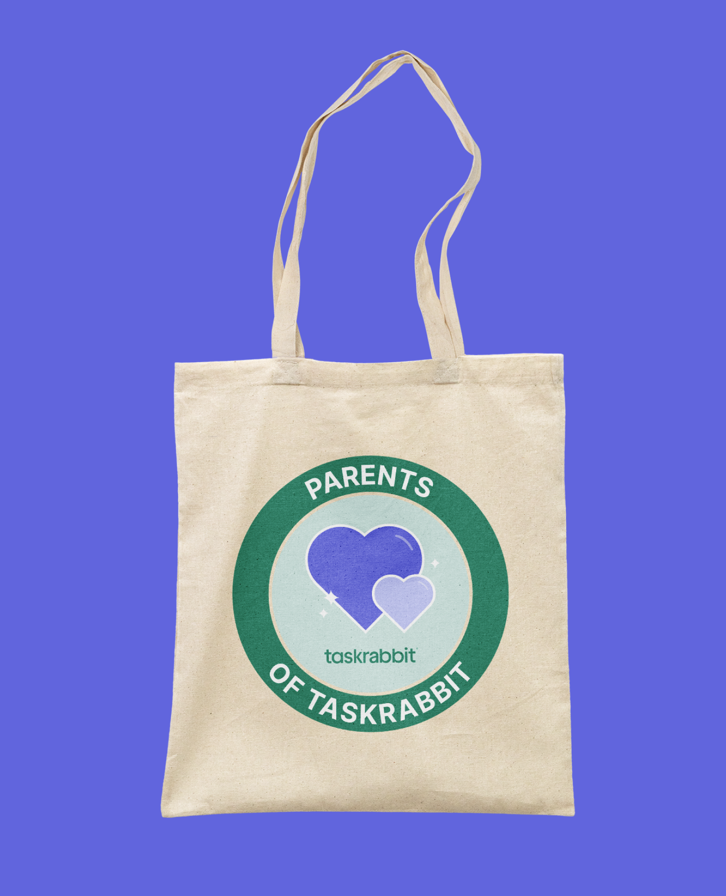
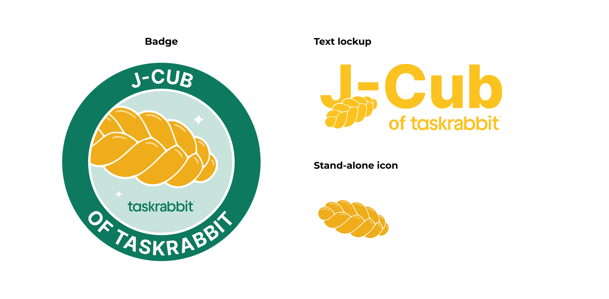
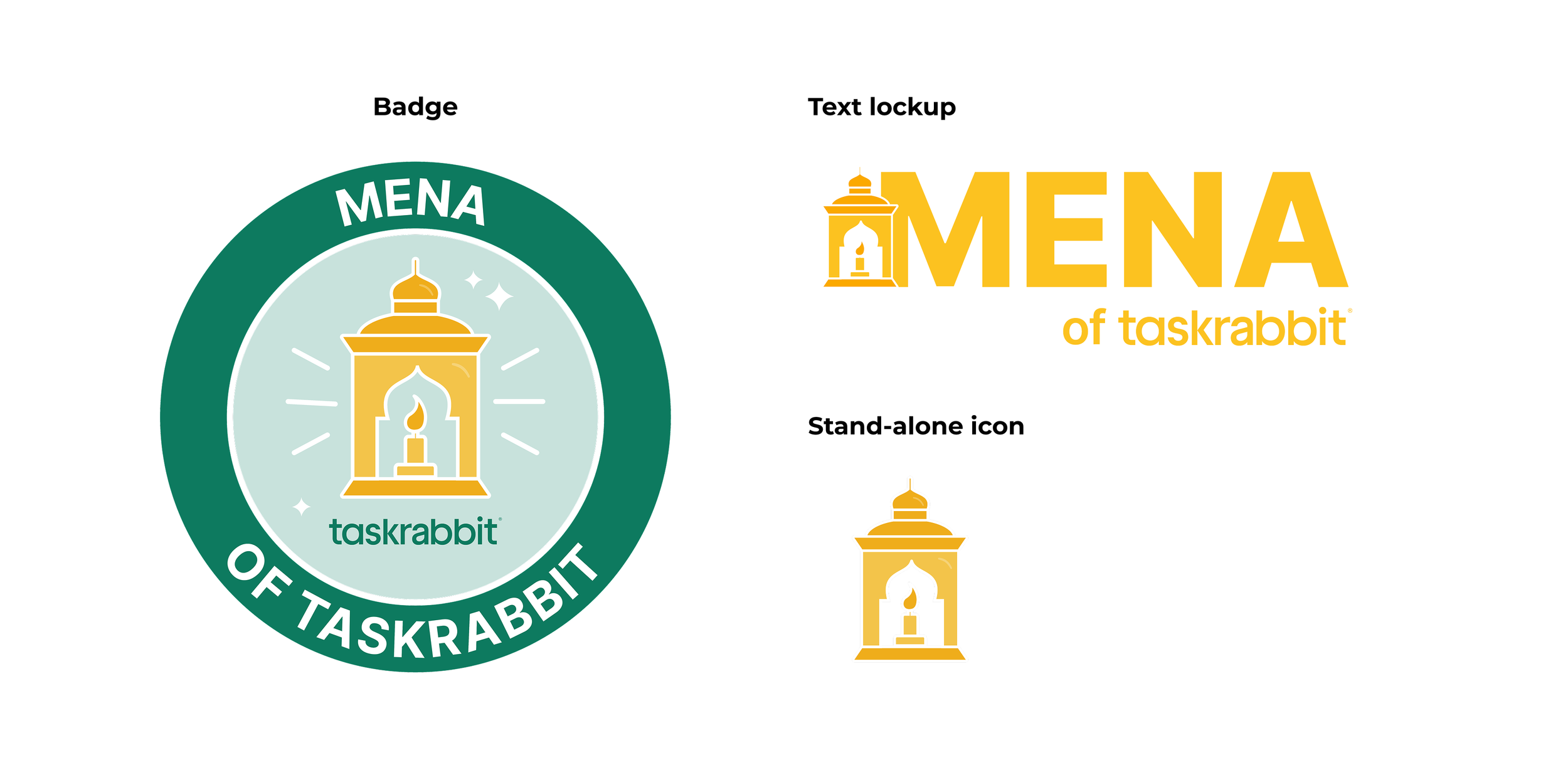
The system included three logo formats for flexible use across digital and physical applications: a badge mark, a text-and-icon lockup, and a stand-alone icon. To ensure authenticity and representation, I conducted research into each group’s core values, culture, and focus area, collaborating directly with members throughout the process. The result is a scalable, inclusive visual system that strengthens internal brand expression while celebrating the individuality of every community within Taskrabbit.


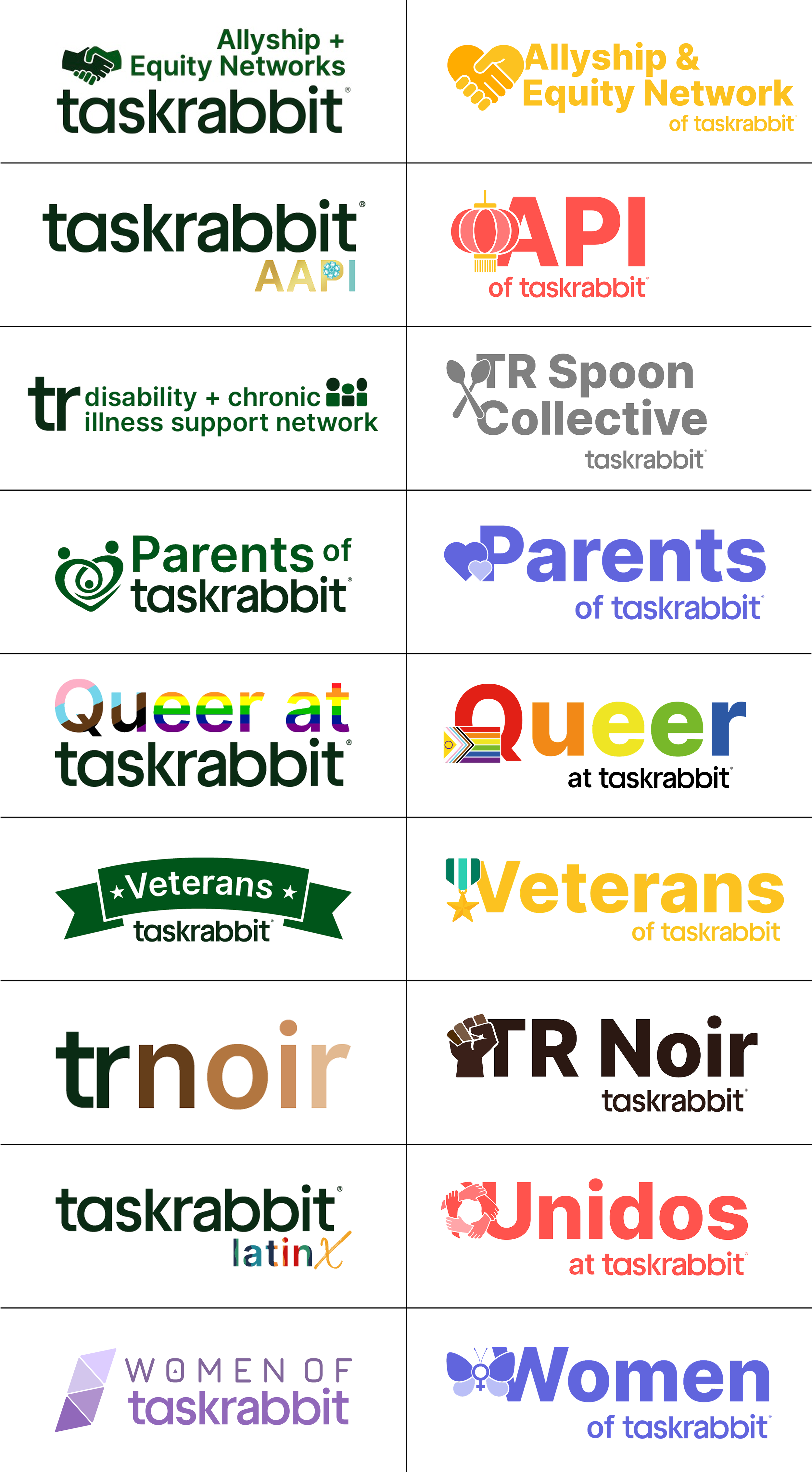
Before the redesign, each Employee Resource Group operated with its own independently created logo, resulting in visual inconsistency across style, color, typography, and brand alignment. Some marks were highly detailed while others were minimal, and many lacked scalable structure or clear usage flexibility.
The updated system creates cohesion while still allowing individuality. Every group now shares a unified design foundation with a consistent badge, icon style, and text lockup, and each group maintains its unique personality through symbols, color accents, and visual cues. The before-and-after comparison highlights the shift from fragmented branding to a balanced and scalable system that strengthens recognition across all employee communities.