Taskrabbit Brand Refresh
Taskrabbit completed a full rebrand in 2022, but after implementation, we recognized gaps that limited how well the system could scale. While the rebrand introduced a new foundation, it didn’t fully support growing product needs or the level of expression required across marketing, design, and brand touchpoints.
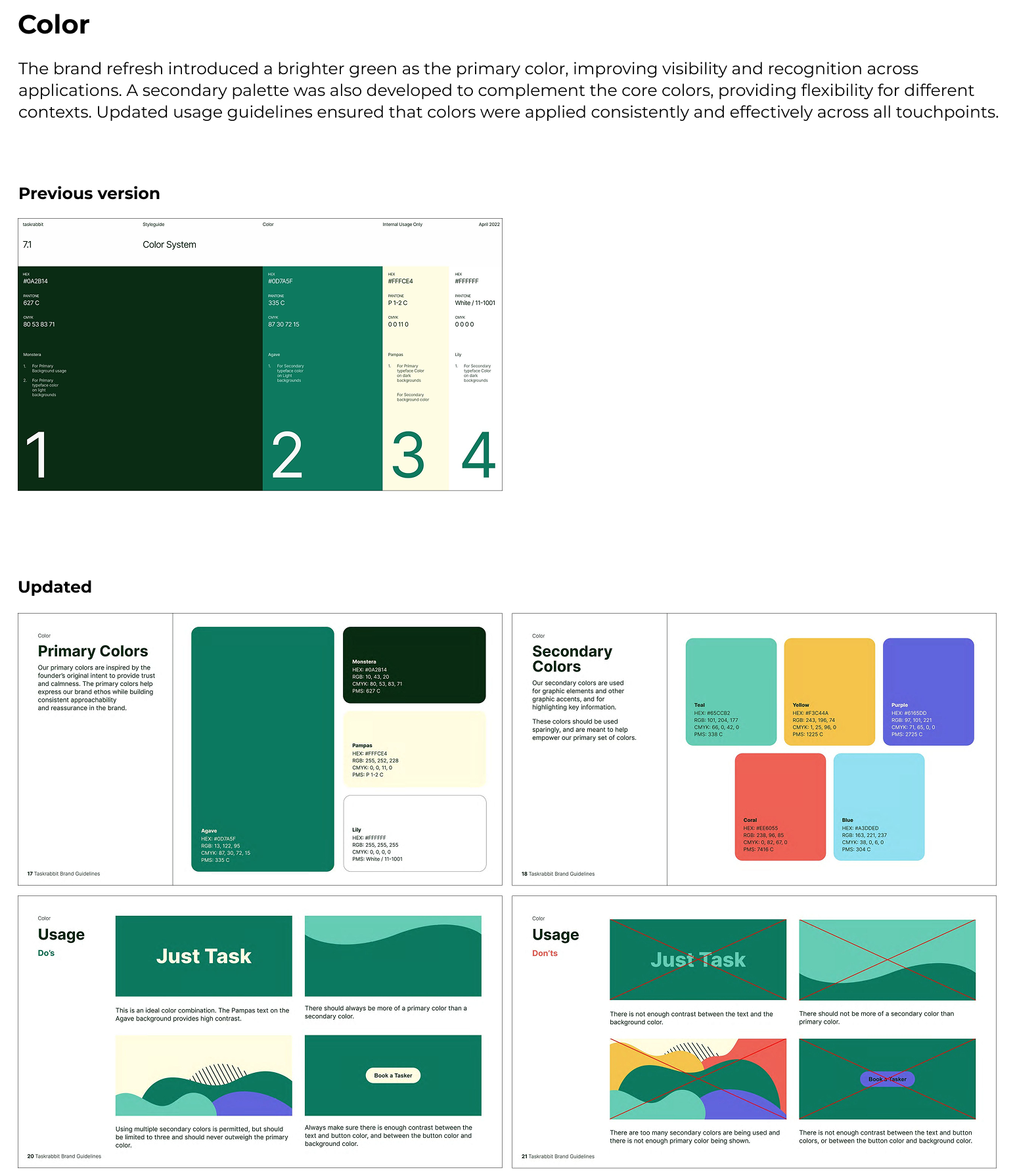
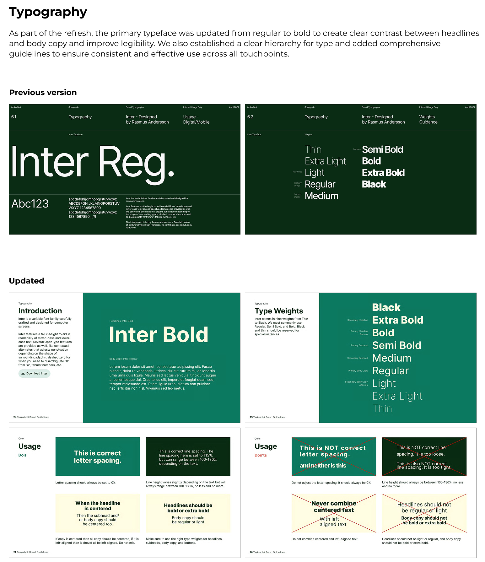
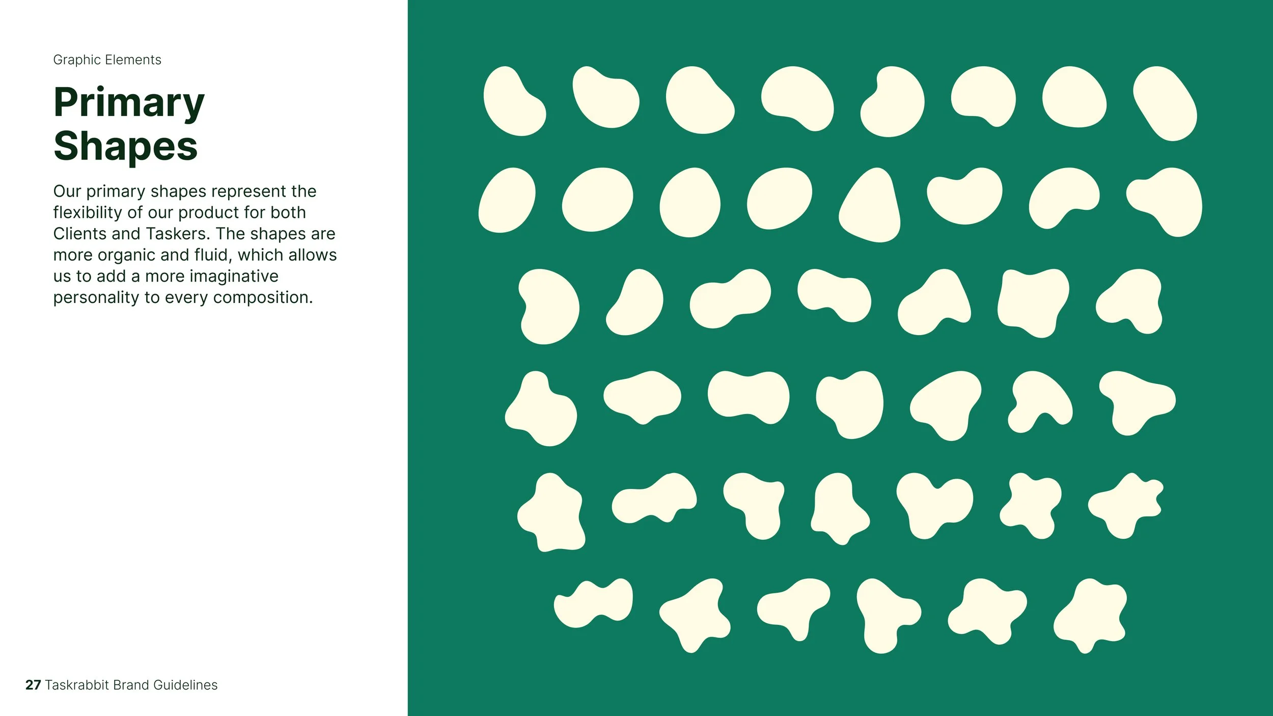
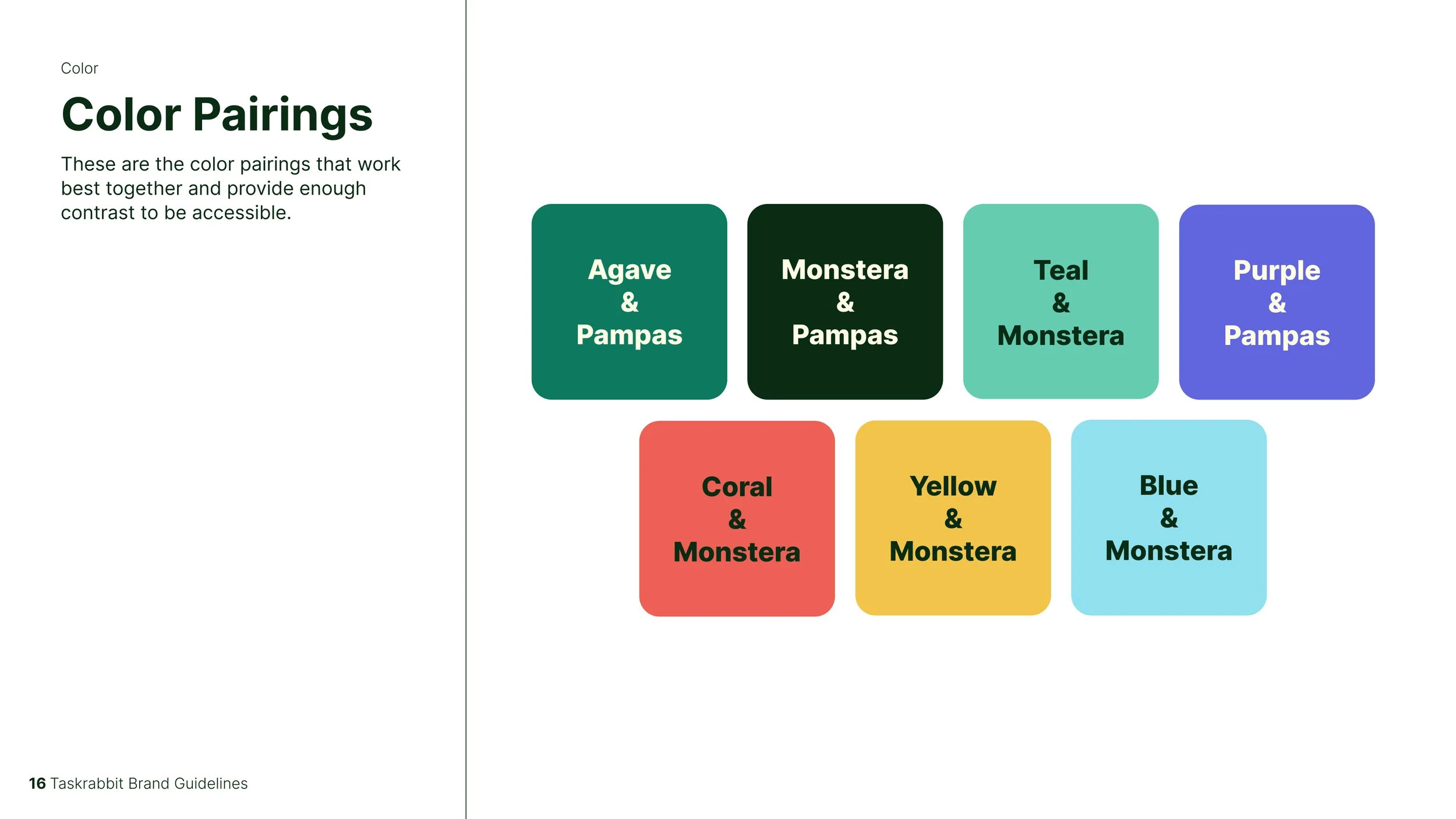
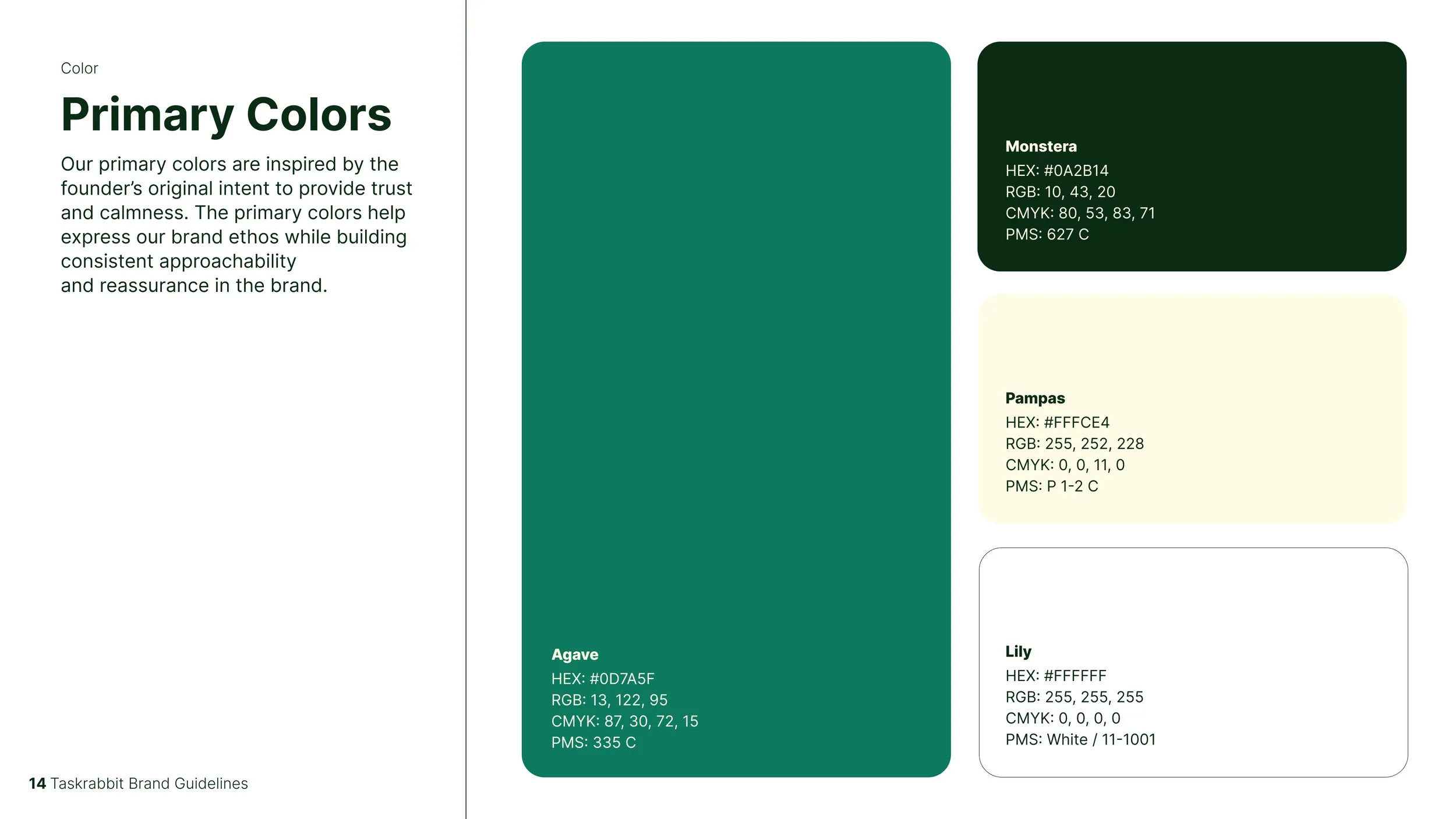
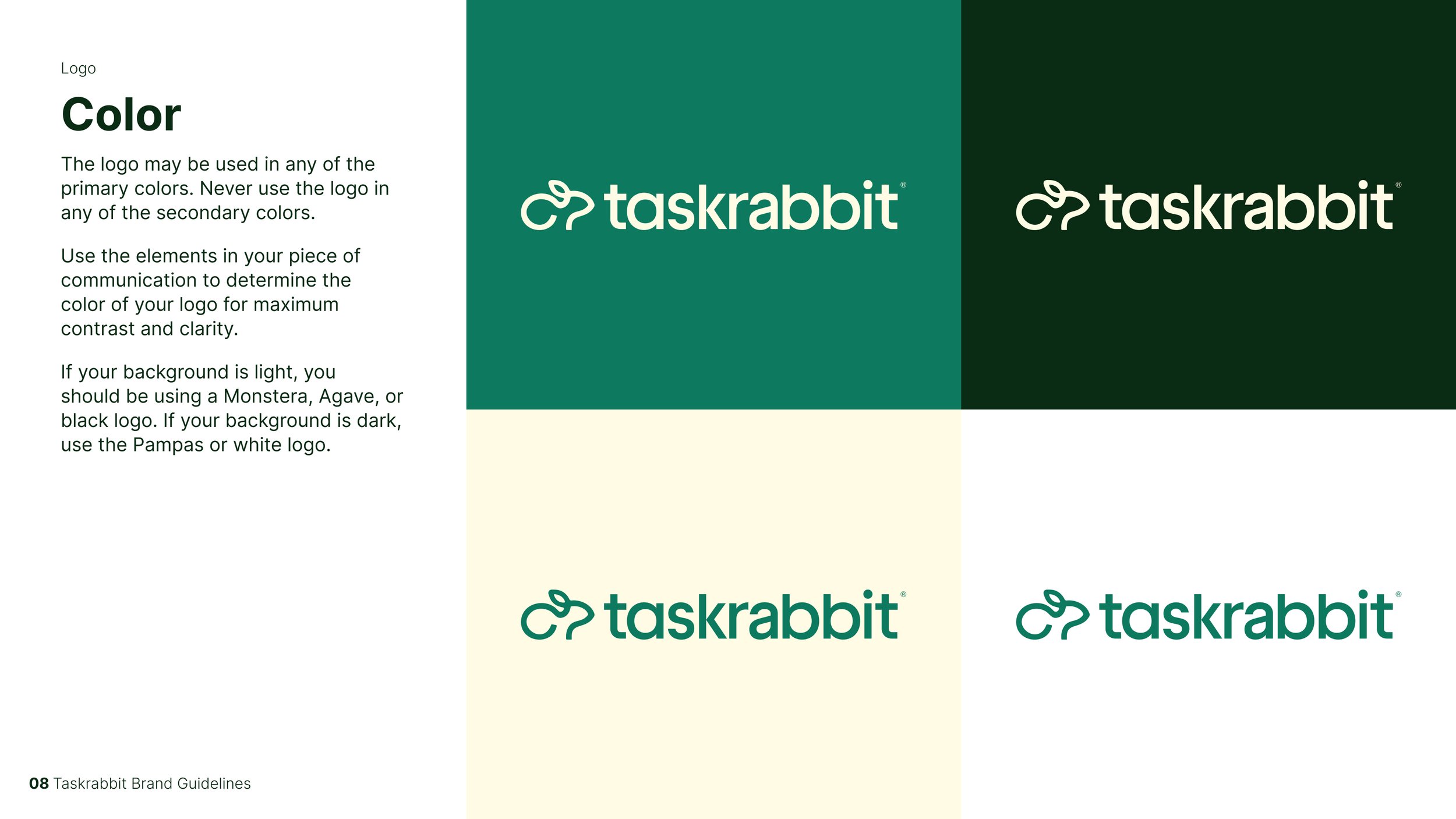
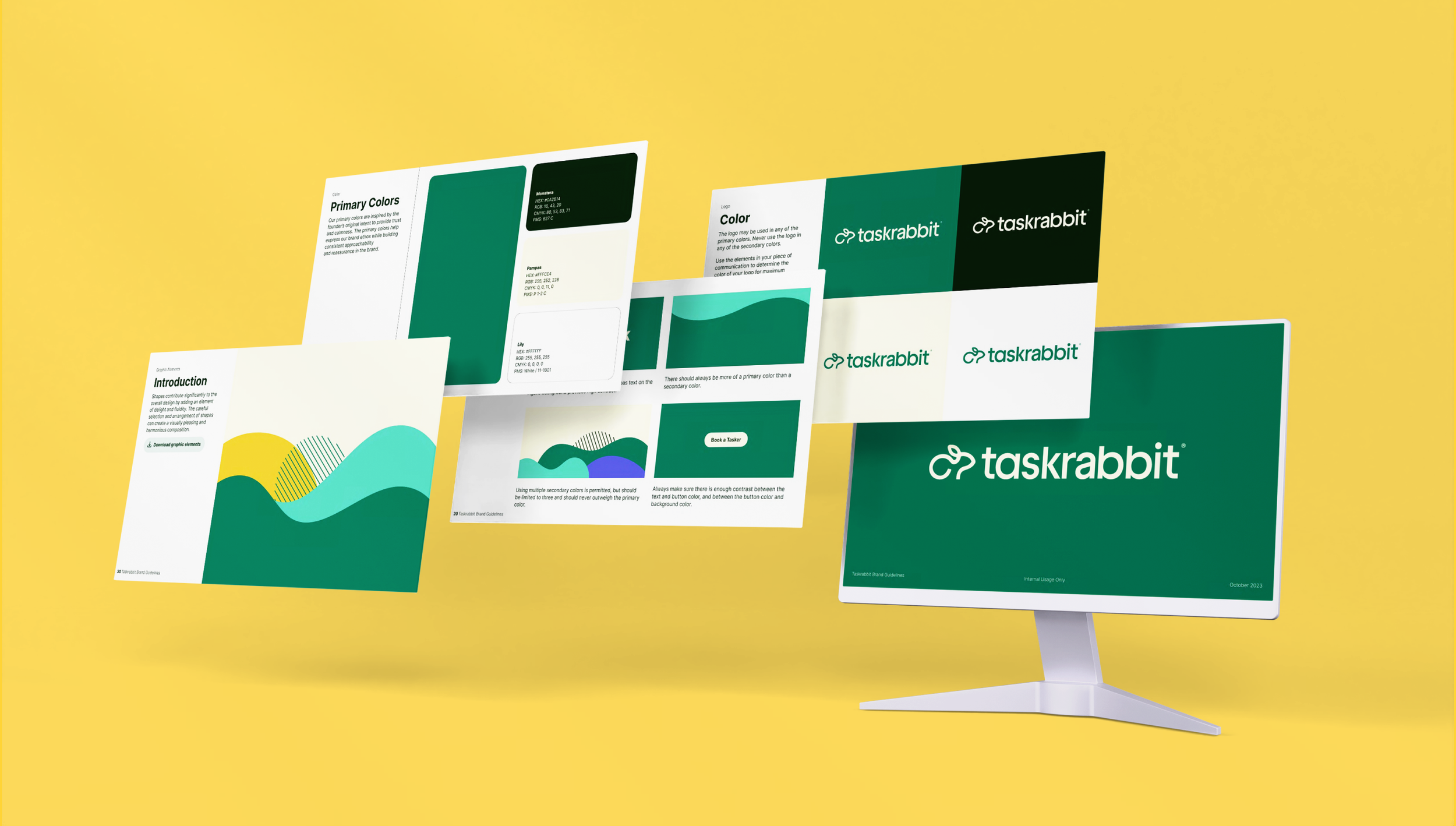
The brand refresh built on the 2022 identity, updating some elements while introducing new ones to make the system more flexible and functional. Key updates included a more distinct and functional color palette (the original dark green often appeared nearly black in use), an expanded set of graphic components that created more visual range and utility, and clearer, more comprehensive guidance for typography, photography, and iconography. We also evolved the brandmark to restore the rabbit icon and pair it with the wordmark for improved recognition and versatility.
This work was a collaborative effort across brand and product, with multiple review stages involving senior leadership. As designer, I developed the updated graphic elements, color system, and icon set, and fully redesigned and rewrote the brand guidelines to ensure the refreshed identity could be applied consistently and confidently across every channel.
Evolution of the brand
The Taskrabbit brand has evolved through several key phases as the company grew and its needs changed. The initial 2022 rebrand introduced a dark green color palette and a single frame graphic element, but it quickly became clear that the system was too limited. During what we call the “Awkward Phase,” the team continued to work within the original guidelines while gradually experimenting with new colors, graphic elements, and icons, resulting in a mix of old and new that lacked cohesion. The final phase followed the brand refresh, when updated guidelines, expanded graphic elements, new icons, and an improved color palette brought the brand to a cohesive, functional, and flexible visual system that could support Taskrabbit across all touchpoints.
Phase One: Orignal Rebrand
The initial 2022 rebrand introduced Taskrabbit’s first fully updated identity, featuring a dark green primary color and a single frame graphic element. While it established a refreshed look and modernized the brand, the palette was very dark, often appearing black, and the limited graphic system didn’t provide enough flexibility to support a growing range of applications. This phase laid the foundation, but it quickly became clear that the brand needed additional elements to be functional and distinctive.
The Awkward Phase
As Taskrabbit quickly outgrew the original rebrand, the team continued working within its limited guidelines while experimenting with new colors and graphic elements. This resulted in a transitional period where old and new palettes, type, and graphics were mixed, creating an inconsistent and sometimes awkward visual identity. While not cohesive, this phase was a necessary step toward identifying what the brand needed to evolve effectively.
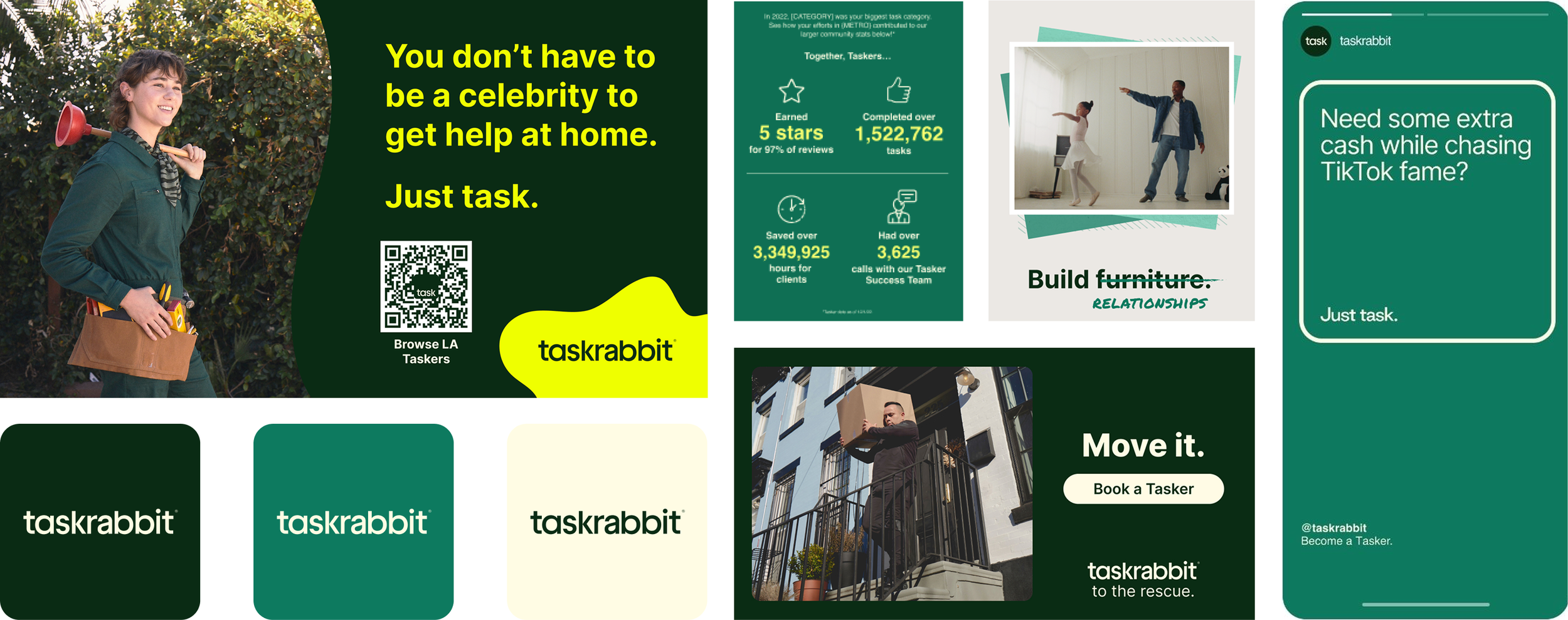
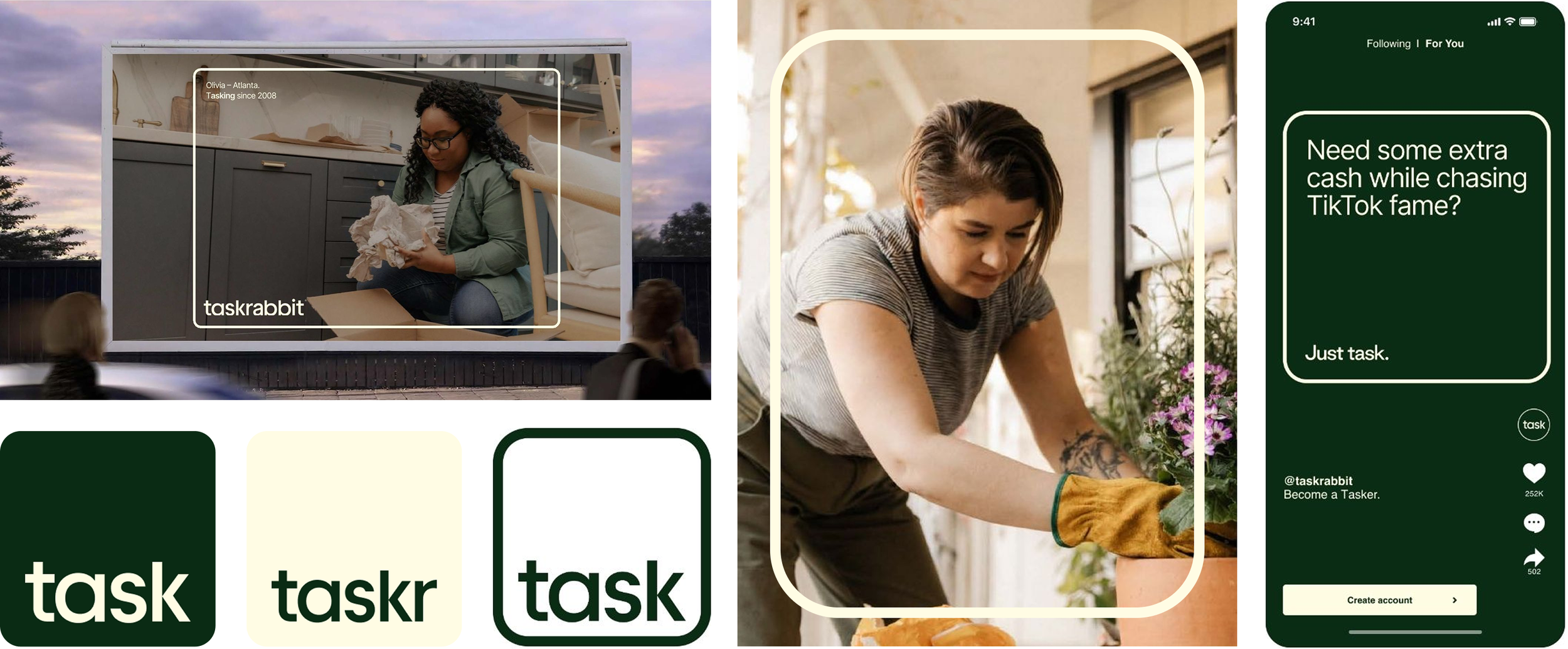
Following the brand refresh, Taskrabbit’s visual identity became cohesive, flexible, and fully functional. Updated guidelines, an expanded color palette, new graphic elements, icons, and a refreshed brandmark, including the rabbit logo, provided the tools needed to create consistent, engaging visuals across all touchpoints, with particular functionality for product and marketing applications. This final phase established a system that could support the brand as it continues to grow and evolve.
The Final Phase: Post-Refresh