Taskrabbit Brandmark Expansion
Taskrabbit previously used a rabbit symbol in its early branding, but leadership removed it during the initial rebrand after deciding the character distracted from the focus on task completion. For roughly two years, the brand operated with only a wordmark, but without a scalable symbol that could adapt to product surfaces, marketing channels, and small-format placements.
Our team identified an opportunity to reintroduce a symbol in a way that supported clarity, functionality, and brand recognition. A simplified icon could improve legibility in constrained spaces, strengthen product and campaign visibility, and bring more flexibility to motion and system design. Gaining alignment required extensive exploration and collaboration across creative and leadership, and we spent several months gathering feedback, refining options, and building a case for why a secondary mark was the right next step rather than a return to the previous one.
Throughout development, I contributed to early concepts and multiple visual directions, collaborating closely with the lead designer as the work progressed through review and refinement. After multiple rounds of feedback with creative and senior leadership, we received approval to introduce the icon alongside the existing Taskrabbit wordmark. The final version selected and implemented is my logo design.


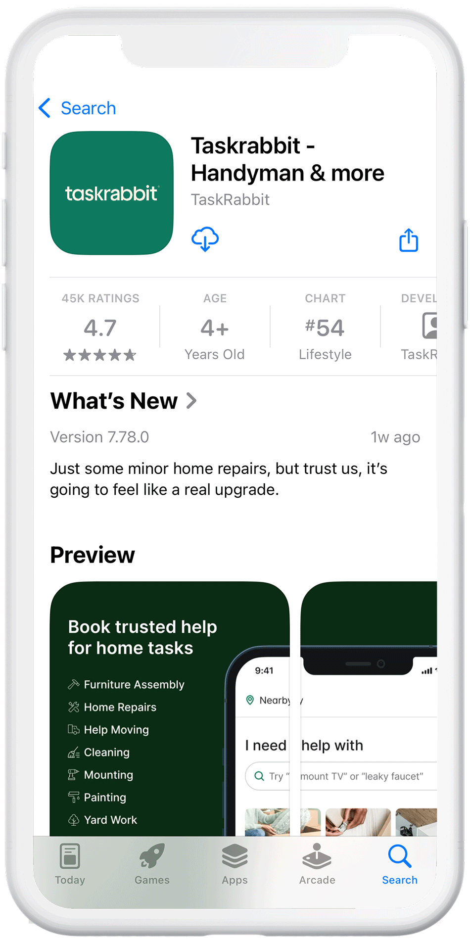
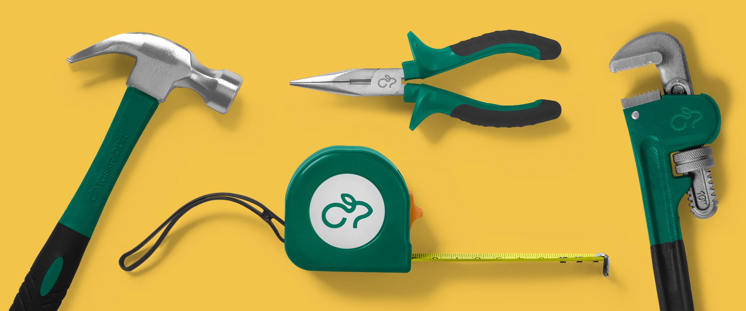
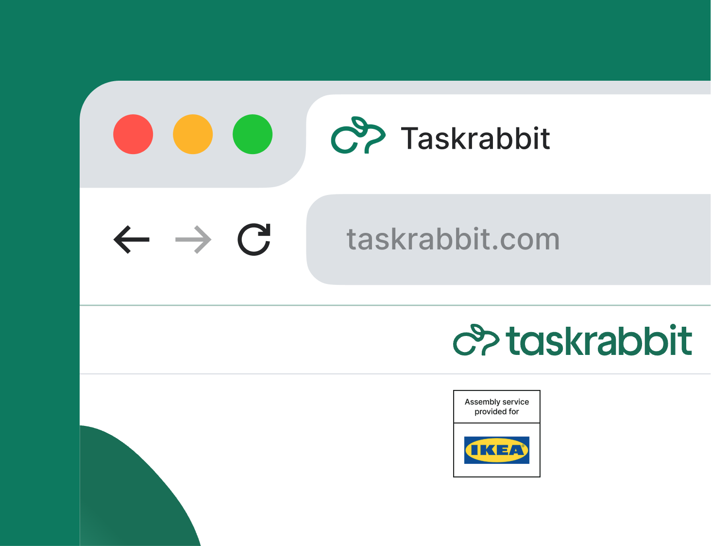
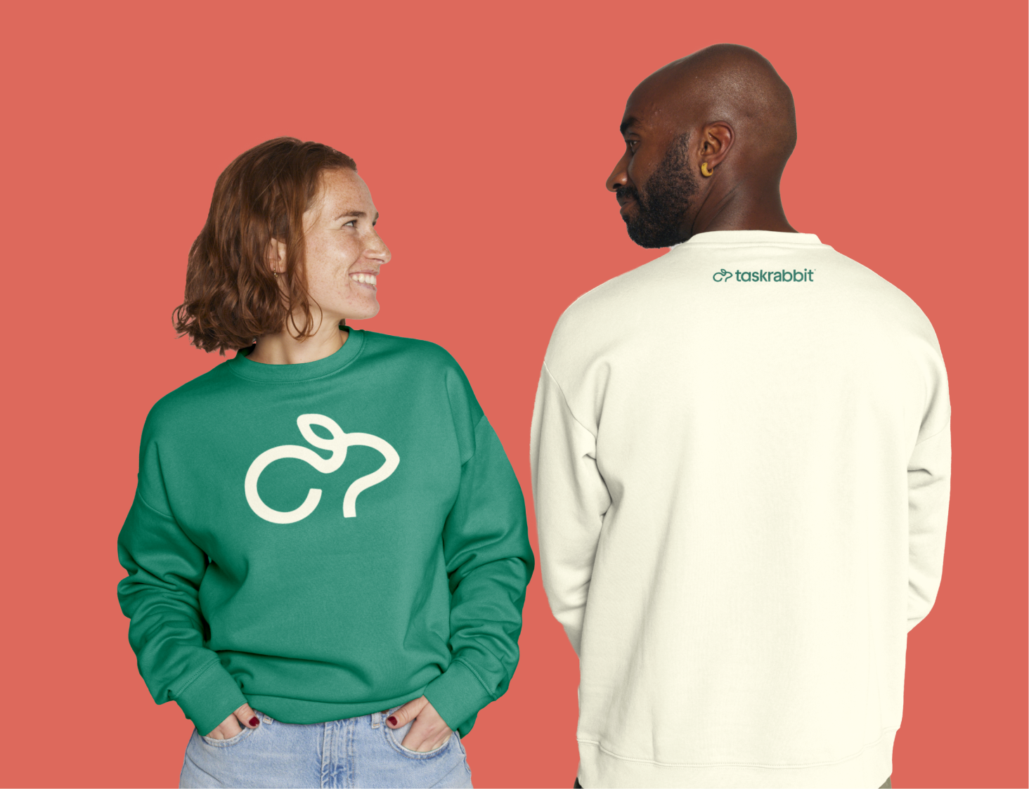
The introduction of the rabbit icon created a clearer visual footprint. Instead of relying on the full wordmark in tight digital spaces, the icon now leads the brand across the app and social media profiles, delivering faster recognition and a more polished, scalable presence.
The rabbit icon was designed to live in visual harmony with the Taskrabbit wordmark. Circular proportions, stroke thickness, and curve rhythm were intentionally aligned so the symbol feels like a natural extension of the existing typography rather than an independent element. This shared geometry allows both pieces to sit comfortably side-by-side and maintain brand cohesion across all applications.

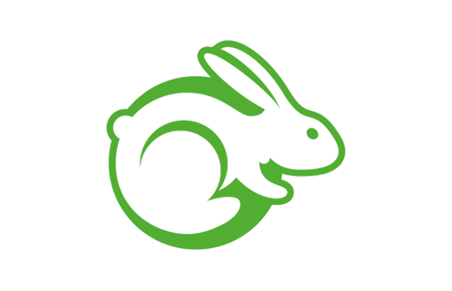
Early explorations pushed a wide range of directions, from highly minimal line-based forms to more natural and literal interpretations. These studies helped define what felt most recognizably “rabbit,” while still aligning with Taskrabbit’s brand DNA. Many of these options were experimental, allowing us to test simplicity, balance, and character before refining into a final direction.